
Flutter is a powerful and popular UI toolkit that allows developers to create stunning and highly customizable applications for both iOS and Android. One of the key features of Flutter is its widget-based architecture, which allows developers to easily style and layout content. In this blog post, we will focus on the Container widget and how it can be used to style and layout content in Flutter.
The Container widget is one of the most basic widgets in Flutter and can be used for a wide range of purposes, including adding padding and margins, setting the background color and image, and defining the border and shadow of a widget. The Container widget is highly customizable and can be used to create complex layouts with ease.
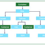
Creating a Container Widget
To create a Container widget, you need to provide it with a child widget. This child widget can be any other widget in Flutter, such as Text, Image, or ListView. You can also add multiple child widgets by using the Column or Row widgets.
Container(
  child: Text('Hello World'),
)
In the above example, we are creating a Container widget with a child Text widget that displays ‘Hello World’. This Container widget will have default styling and layout, which means that it will fill the available space in the parent widget.
Adding Padding and Margin
One of the most common use cases of the Container widget is to add padding and margin to the child widget. Padding adds space around the child widget, while margin adds space around the Container widget.
Container(
  margin: EdgeInsets.all(10),
  padding: EdgeInsets.all(10),
  child: Text('Hello World'),
)
In the above example, we are adding 10 pixels of margin and padding to the Container widget. This will create a space of 10 pixels between the Container widget and its parent widget and between the child widget and the Container widget.
Setting Background Color and Image
You can also set the background color and image of the Container widget. You can use the color property to set the background color of the Container widget, and the decoration property to set the background image.
Container(
  color: Colors.blue,
  decoration: BoxDecoration(
    image: DecorationImage(
      image: AssetImage('assets/images/background.png'),
      fit: BoxFit.cover,
    ),
  ),
  child: Text('Hello World'),
)
In the above example, we are setting the background color of the Container widget to blue and adding a background image to the Container widget. The background image will be centered and cover the entire Container widget.
Defining the Border and Shadow
You can also define the border and shadow of the Container widget. You can use the border property to set the border of the Container widget and the boxShadow property to set the shadow of the Container widget.
Container(
  decoration: BoxDecoration(
    border: Border.all(
      color: Colors.black,
      width: 2,
    ),
    boxShadow: [
      BoxShadow(
        color: Colors.grey.withOpacity(0.5),
        spreadRadius: 5,
        blurRadius: 7,
        offset: Offset(0, 3),
      ),
    ],
  ),
  child: Text('Hello World'),
)
In the above example, we are adding a black border with a width of 2 pixels to the Container widget and a grey shadow with a spread radius of 5 pixels, a blur radius of 7 pixels, and an offset of (0, 3) pixels. This will create a shadow effect that makes the Container widget look like it is floating above the parent widget.
Conclusion
The Container widget is a powerful and versatile widget in Flutter that can be used to style and layout content in a wide variety of ways. By adding padding and margin, setting the