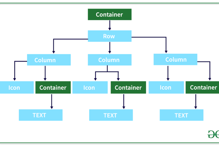
Flutter is a popular open-source framework for building mobile applications. It provides a vast array of widgets that can be used to create beautiful and functional user interfaces. In this blog post, we’ll take a look at the most commonly used Flutter widgets and how to use them effectively.
1. Container Widget
The Container widget is one of the most versatile widgets in Flutter. It allows you to create a box-like element that can be customized with various properties such as padding, margin, background color, border, and more.
Here’s an example of a Container widget that has a blue background color and a 10-pixel margin:
Container(
  margin: EdgeInsets.all(10),
  color: Colors.blue,
);
2. Text Widget
The Text widget is used to display text in your application. It supports various properties such as font size, color, alignment, and more.
Here’s an example of a Text widget that displays the text “Hello World!” with a font size of 24 and a red color:
Text(
  'Hello World!',
  style: TextStyle(
    fontSize: 24,
    color: Colors.red,
  ),
);
3. Row and Column Widgets
The Row and Column widgets are used to display children widgets horizontally and vertically, respectively. They allow you to create complex layouts by combining multiple widgets.
Here’s an example of a Column widget that contains two Text widgets and a Container widget:
Column(
  children: [
    Text('Title'),
    Text('Subtitle'),
    Container(
      margin: EdgeInsets.all(10),
      color: Colors.blue,
    ),
  ],
);
4. Image Widget
The Image widget is used to display images in your application. It supports various properties such as width, height, fit, and more.
Here’s an example of an Image widget that displays an image from a URL with a width of 200 pixels and a height of 200 pixels:
Image.network(
  'https://example.com/image.jpg',
  width: 200,
  height: 200,
);
5. ElevatedButton and TextButton Widgets
The ElevatedButton and TextButton widgets are used to create buttons in your application. They support various properties such as text, color, onPressed, and more.
Here’s an example of an ElevatedButton widget that displays the text “Click Me!” and changes the background color to blue when pressed:
ElevatedButton(
  onPressed: () {},
  child: Text('Click Me!'),
  style: ElevatedButton.styleFrom(
    primary: Colors.blue,
  ),
);
6. TextField Widget
The TextField widget is used to create input fields in your application. It supports various properties such as controller, keyboardType, decoration, and more.
Here’s an example of a TextField widget that accepts text input and displays a hint text:
TextField(
  decoration: InputDecoration(
    hintText: 'Enter text here',
  ),
);
Conclusion
In conclusion, these are some of the most commonly used Flutter widgets that you can use to create beautiful and functional user interfaces in your application. Understanding the properties and use cases of these widgets will help you create effective UI components for your Flutter app. Keep in mind that there are many more widgets available in Flutter, so don’t hesitate to explore the documentation to find the perfect widget for your needs.


